

Publishing, sharing & embedding
Publishing
Publishing is the action that bridges editing your widget and making it available to your users.
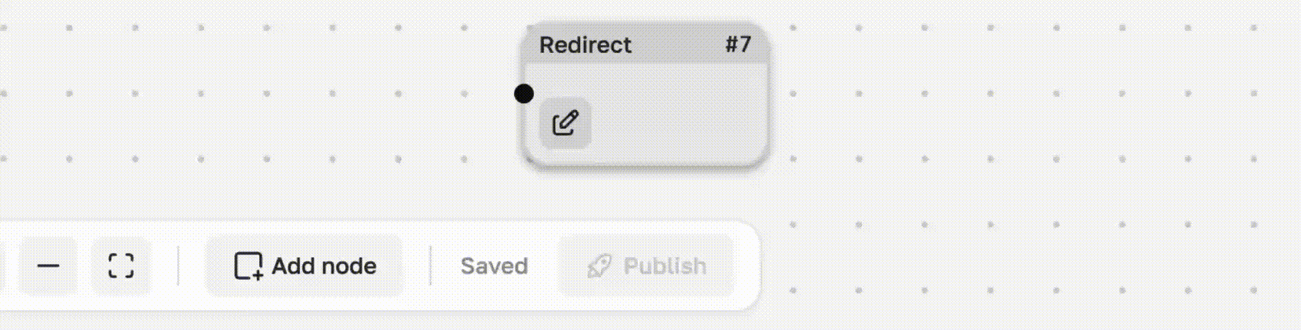
You can only publish if your widget flow has unpublished changes. You’re free to modify the widget flow however you like — add or remove flow nodes, adjust settings, and so on — your users won’t see any of these changes until you click Publish. The widget flow editor saves all your changes automatically but does not publish them. While editing, you’ll notice the status changes to Draft, meaning there are unsaved changes. When the status switches to Saved, your data is safely stored, and you can close the page without losing your work.
After publishing, the current version of your widget flow is deployed to production. This means your users will start receiving the new version of your widget.
This may take a short time, usually no more than a minute.
If a widget has never been published (for example, after creation or restoration from archive), your users will see an error. This error will also appear on the Results tab.
Once the widget is published, the error disappears.
Sharing & Embedding
Once published, the widget is automatically available, regardless of your embedding or sharing option.
Sharing means an automatically hosted page for your widget is available at https://share.widged.io.
Embedding means adding the widget to your own page as a web component, iframe, or using framework libraries (such as React).
Below are more detailed ways to share and embed the widget.
Web Component
The main and recommended way to embed a widget. Embedding it this way requires just two lines of code. First, add the widget script to your site's <head>:
<script type="module" src="https://cdn.widged.io/element.js"></script>This script loads the widget functionality on your page. To render the widget, use the custom web component. Think of a web component as a custom HTML element, just like <div> or <span>.
A basic embed looks like this:
<widged-element widget-id="..."></widged-element>The widget will appear exactly where you place it. It will take up 100% of the width and automatically adjust its height based on the its content.
You can add multiple widgets on a single page, using the same or different widget IDs.
Besides widget-id, you can pass other parameters. A full list of parameters and their descriptions is provided below.
INFO
The widget reads parameters only when the flow execution starts — any programmatic changes to parameters afterward will be ignored.
React Component
The React component is a simple wrapper around the web component, automatically passing the parameters through. To use the widged.io element React component, you need to install the official package:
npm i --save @widged.io/element-reactAfter that, you can use the component anywhere in your application:
import { WidgedElement } from '@widged.io/element-react';

const App = () => {
    return (
        <div>
            <WidgedElement widgetId="..." />
        </div>
    );
};
Don't worry about loading scripts, The React component handles loading the widged script and deduplicating these scripts on the page.
WARNING
Because React uses reactivity, changing props will remount the widget. When remounted, the widget’s internal state will reset.
React uses a rendering key that is calculated from all the props passed. Note that there is no need to memoize the data object, as the key calculation algorithm is based on its contents, not on object references.
The React component exposes the same API as the web component — it’s just a wrapper, with parameters renamed for a more idiomatic React style.
Share Link
If you don’t have a website yet or want to test your widget before embedding, you can use the share link.
Every widget automatically hosted on a dedicated pages, which follows the same rules and updates when you publish.
The key difference is that you don’t have direct access to the <widged-element> tag. Instead, you pass parameters through the link. We provide a tool for generating these links in the Studio.
INFO
Lazy loading is not supported with share links as it has no practical benefit in this context.
WARNING
If you use a stricter allowed origins setting than the default (*), make sure to add https://share.widged.io to the list if you plan to use a share link or iframe.
iframe
If you prefer to embed the widget as an iframe, you can simply use the share link described above as the iframe’s source.
<iframe width="100%" height="800" src="SHARE_LINK_HERE" title="widged.io" frameborder="0"></iframe>Other Approaches & CMSs
If you encounter difficulties installing your widget, please reach out to care@widged.io. We can provide detailed instructions tailored to your setup or arrange a call to help you get our widgets running on your site.
Options
You can customize your widget installation using options. The table below lists the available options with descriptions and their support across different installation types.
| Option | Description | Web Component | React | Share Link | iframe |
|---|---|---|---|---|---|
debug | Enables debug mode, showing additional information in the browser console | ✅ | ✅ | ✅ | ✅ |
lazy-load | Loads the widget only when it becomes visible in the viewport | ✅ | ✅ | ❌ - Widget always renders inside viewport | ❌ - Widget always renders inside viewport |
pixel | Enables tracking of widget interactions | ✅ | ✅ | ❌ - The main paint of share page is to show widget | ❌ - The main paint of share page is to show widget |
data- attributes | Allows passing data to the widget via data-* attributes | ✅ | ✅ | ✅ | ✅ |
Data attrbuites in React
In React, data attributes are passed using the data object. Note that the data- prefix must also be preserved:
import { WidgedElement } from '@widged.io/element-react';

const App = () => {
    return (
        <WidgedElement widgetId="..." data={{ 'data-name': 'John Doe' }} />
    );
};
Content-Security-Policy
Just do nothing if you don't know what this is.
If your site uses Content Security Policy (CSP), you’ll need to add the necessary directives for Widged services to function properly. Below is the full set of required directives:
Content-Security-Policy:
    script-src https://cdn.widged.io blob:;
    img-src https://cdn.widged.io;
    connect-src https://flow-api.widged.io https://geo.widged.io;
    style-src 'unsafe-inline' https://fonts.googleapis.com;
    font-src https://fonts.gstatic.com;
The directives listed above are only those required for Widged widgets. For production you need to merge your existing CSP with the necessary permissions shown above.